What Makes a Good
Therapy Website?
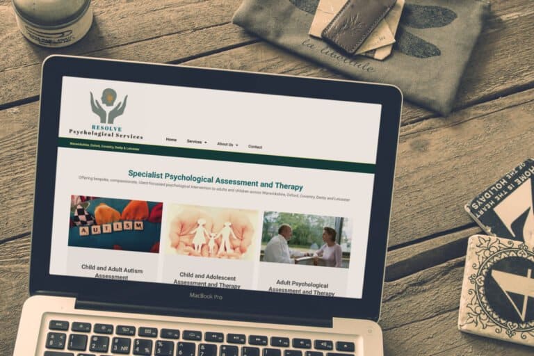
Most therapy websites look professional enough on the surface. But looking professional and actually working for your practice are two different things. Here is what separates the sites that bring in enquiries from the ones that quietly don't.
Your client is searching at a difficult moment
Before we talk about design, it helps to think about who is actually visiting your site and what state they are likely to be in when they arrive.
Someone searching for a therapist is rarely doing it out of casual curiosity. They are usually at a point where something has become difficult enough that they are ready to ask for help. That is a vulnerable position. They are scanning quickly, making instinctive judgments, and looking for a reason to feel safe enough to make contact.
This changes how you should think about your website. It is not a portfolio. It is not a CV. It is the first moment of contact with someone who needs to feel that you understand them before they will trust you with anything personal.
"A good therapy website doesn't just describe your services. It makes the right person feel seen before they've even picked up the phone."
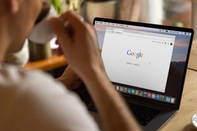
The first impression happens in under three seconds
Research consistently shows that visitors form a strong impression of a website within the first few seconds - often before they have read a single word. That impression is based almost entirely on visual cues: the layout, the colours, the imagery, the sense of space on the page.
For therapy websites this matters enormously. A cluttered layout, stock photos of people crying on sofas, or a colour scheme that feels clinical and cold - any of these can trigger an unconscious decision to leave before the visitor has given your words a chance.
Calm, considered design is not just an aesthetic preference. It is a clinical communication. It tells the person landing on your site that you are organised, thoughtful, and safe to approach.
Talking to your client, not about yourself
This is the mistake most therapists make when they write their own website copy. Understandably, they write about their qualifications, their modalities, their training journey. All of that matters - but not as an opener.
The person visiting your site is thinking about themselves, not you. They want to know: do you understand what I am going through? Have you helped people like me? Will working with you actually make a difference?
The most effective therapy websites lead with the client's experience - naming the difficulty they are carrying, acknowledging what has brought them here - before moving into who you are and how you work. Empathy before credentials.
The three questions every therapy site must answer
Strip everything back and a therapy website needs to answer three questions clearly and quickly:
- Who do you help? - Be specific. "Adults experiencing anxiety, depression, and relationship difficulties" is more reassuring than "individuals, couples, and families."
- What does working with you look like? - A brief, plain-language description of your approach and what a client can expect from the process.
- How do they take the next step? - A visible, simple, low-pressure way to make contact. Phone number, email, or a short form. No unnecessary barriers.
If a visitor has to hunt for any of these, most of them won't bother. Not because they don't want help - but because uncertainty at that moment feels like too much.
Mobile is where most of your visitors are
The majority of people searching for a therapist are doing so on their phone. Often late at night, often in a private moment, often quickly. If your site is hard to navigate on a small screen - text too small to read, buttons too close together, pages that load slowly - you are losing people who were ready to reach out.
A mobile-ready site is not optional. It is the baseline expectation. And it goes beyond just fitting on a screen - it means the experience of using the site on a phone feels natural, fast, and unfrustrating.
What good looks like in practice
A good therapy website is calm without being bland. It is warm without being unprofessional. It speaks directly to the person who needs help without making them feel labelled or reduced. It loads quickly, works on every device, and makes the path to making contact as short and simple as possible.
It does not need to be complicated. Some of the most effective therapy sites are also the most straightforward - a clear heading, a good photo, honest copy, and an easy way to get in touch. The design serves the communication, not the other way around.
If your current site is not doing these things, it is not just underperforming - it is probably turning away people who genuinely need what you offer.